Back to the original formula
Building LogiCola's new design language from what I found reverse-engineering the 2008 original.
By Malik Piara · Sep 8, 2026
Announcements
Two years ago, I set out to design and release an updated version of LogiCola with the goal of preserving Professor Gensler’s work and introducing a more accessible solution that could be used by students carrying any device or operating system. Since the original was built for Windows, many students were not able to use it.
Today, many students use Chromebooks or mobile devices. In August, more than 100 devices in Asia visited LogiCola 3 in a single week and 72 of them did at least one exercise. Of those, 66 came from the Philippines. Over half of them were phones and tablets. This is a signal I receive with enthusiasm. The product seems to be delivering on the original promise I made in 2024.
Today I’m releasing a new version that answers the feedback you shared through the Hacker News discussion, GitHub issues and email. This release brings back mastery learning through infinite translation drills and embeds some of the playfulness from the original software with my own touch.
On soul sucking design
The landing page prioritised the wrong goals and put more emphasis on user acquisition through an email subscription form than it did on the logic drills.
Other commenters noted the design felt too modern and out of place. My initial redesign made LogiCola 3 feel like enterprise software, a departure from the vibrancy of the old interface:
Making the port look modern by using a modern look makes tons of sense. The soul sucking feeling it produces comes from the modern look’s motivations, which is not the author’s fault alone, but instead from the ‘market and sell everything’ era we current live within.
The colourful backgrounds that change on every refresh have been one of the defining elements of the original brand. I borrowed the colour treatment from the original, but assigned a unique palette to every set. Syllogistic and propositional logic wear different colours. This way, you’ll always know where you are.
The Color dialog found in the 2008 program reveals nine colour schemes, each at three depths: Pastel, Moderate and Deep. Here are six of the schemes, with a background, a panel and a dark band along the foot. Roll the dice to see random ones, and try the three depths:
#CDFFFF · #FFCDCD
#FFCDCD · #CDFFFF
#CDCDFF · #FFFFCD
#FFFFCD · #CDCDFF
#CDFFCD · #FFCDFF
#FFCDFF · #CDFFCD
Here’s the screen that used to open every exercise, against the one that opens it now. Drag the slider to compare.
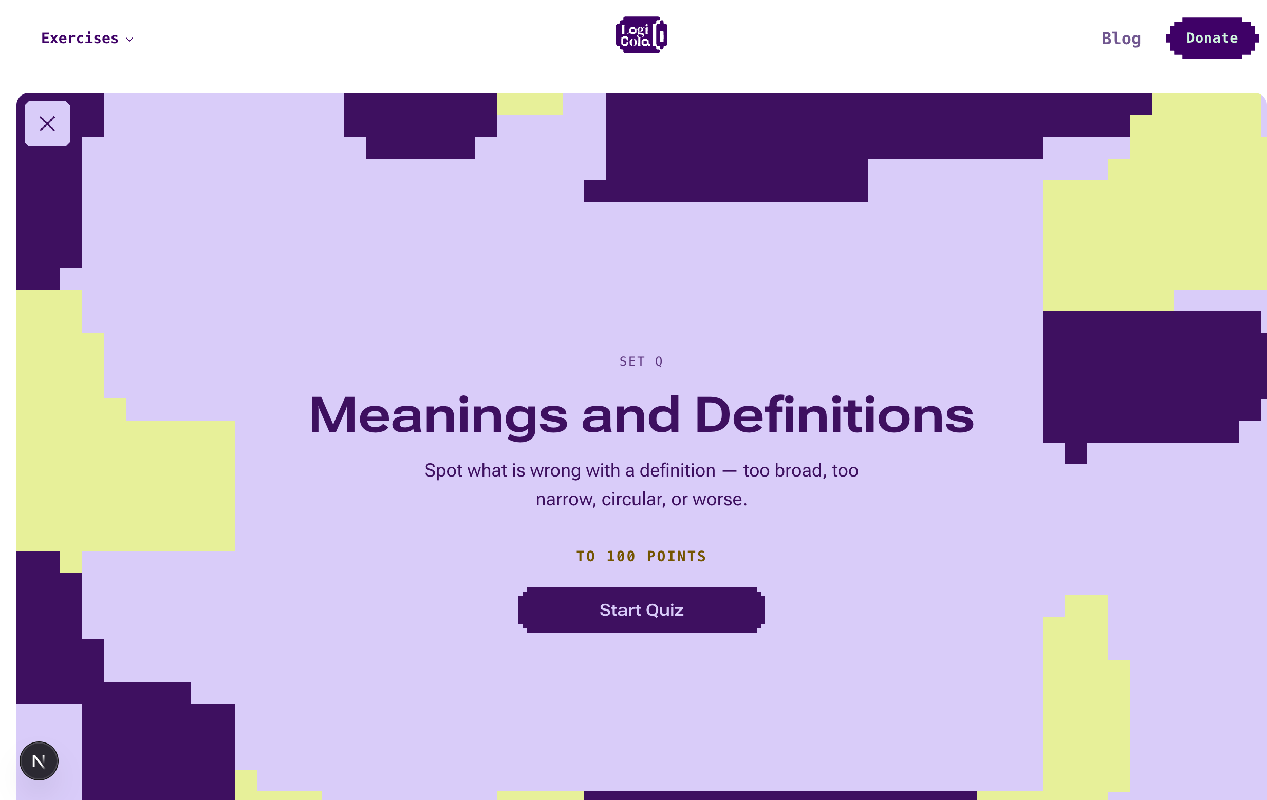
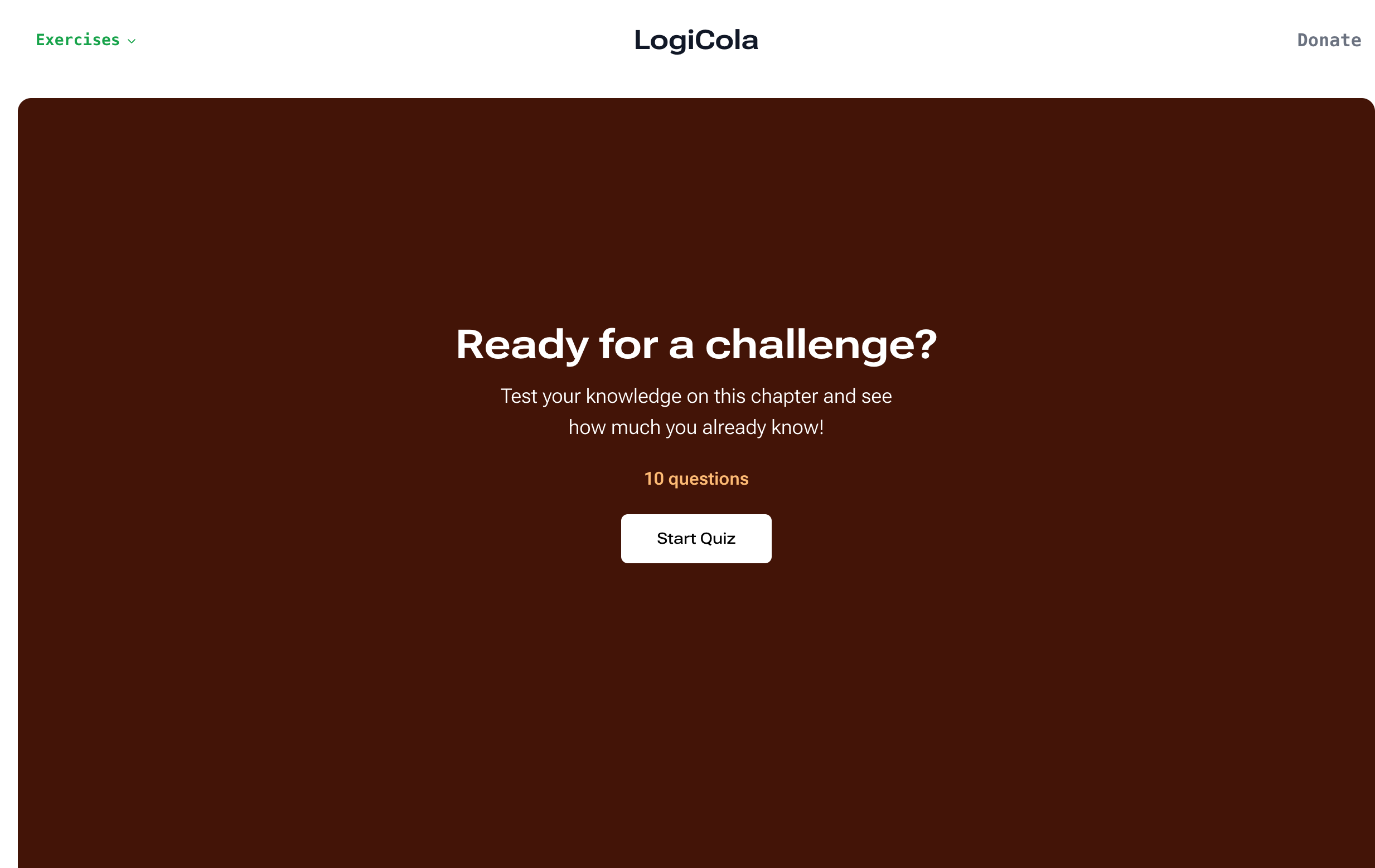
Both the old headline, “Ready for a challenge?”, and the description were taken directly from Khan Academy. Every set featured the same screen because they were afterthoughts for a release that was focused on bringing you logic practice. The new quiz window gives you context: which set and which type of logic drill you’re in, before you advance.
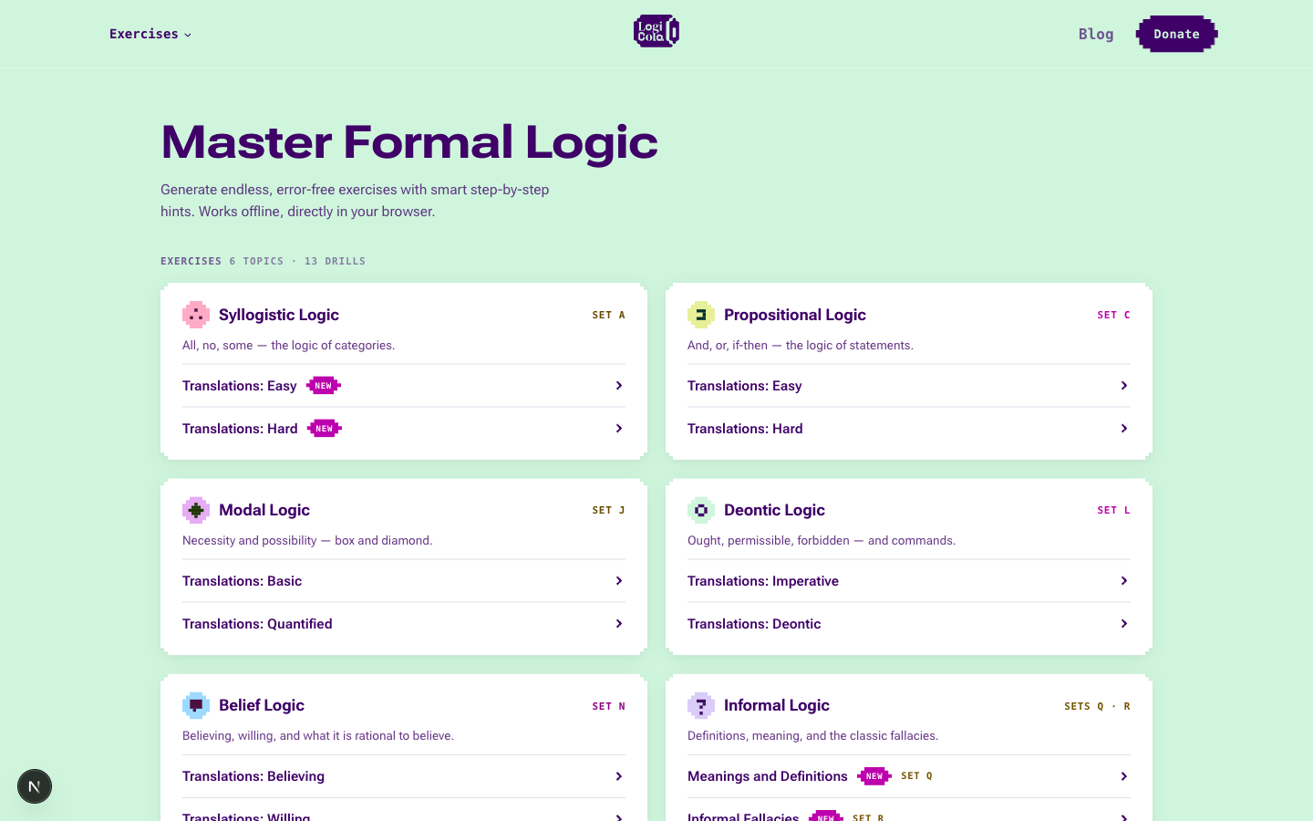
The drills are on the front page now, so you can pick one and get started right away.
How the original made its colours
Each of the little screens in the last section is composed the
way the program composes a real one, from colours that are computed instead of handpicked. Every pastel is a
saturated hue pushed light. Every pair sets a hue against its complement on an RGB colour
wheel: aqua with rose, blue with cream, lime with magenta. And the dark
strip along the bottom is the background colour run through
InvertRect,
a Windows drawing function that performs a logical NOT on the colour
values of every pixel in a rectangle. Every bit flips. For a byte, that
is the same as taking it away from FF: FF - CD = 32, and
FF - 00 = FF. The strip is the exact complement of its own background, and
the black title text goes white by the same rule.
Here is the whole scheme, reconstructed from the decompiled routine:
level      = 0xCD                    # Pastel (0xB9 Moderate, 0x91 Deep)
background = rgb(level, 0xFF, 0xFF)  # Aqua
panel      = rgb(0xFF, level, level) # Rose
band       = ~background             # InvertRect
When you change the depth, only level changes; the pinned FF channels never
move, which is why deeper schemes grow more intense instead of going
muddy. The band follows wherever the background goes.
How the new colours were chosen
While speaking with a friend, I realised I would never be able to give LogiCola 3 an identical voice to the original because I’m not Gensler. So instead of making a carbon copy, I decided to leave my own imprint while honouring the heritage. I spent the last winter reading books about eponymous fashion houses like Gucci, Chanel, Dior and Louis Vuitton. Chanel has had only three official successors. Reading about how they operated and how they drew inspiration from the original source, while keeping the brand relevant and authoring new products emboldened me to wear a similar hat.
I wanted to pick colours that evoked the original while bringing new excitement. And I was hoping to make every set rhyme, while keeping them different enough that you could tell them apart. The colour schemes had to work well together and in isolation.
Ruxandra Duru authored a brilliant toolkit on how to combine two colours based on the amount of stimulation they can create. Later, she built a tool that suggests pairs of colours based on a selected amount of stimulation, along with Brian Li. Since this was exactly what I was trying to do, I ported the model behind it and started experimenting.
Stimulation comes out of three terms: overall intensity, the lightness gap between the two colours, and the distance between their hues. The end result tells us how much visual excitement a pair generates, ranging from sleep coma to hyper excitement. I aimed to create pairs that were in between both extremes.
To make the colour schemes of every set feel connected, I picked pairs within the 0.45–0.58 stimulation interval. I added white to every hue, to soften them and preferred pale surfaces over dark ones, to make the platform feel playful but not heavy. To create stronger cohesion between sets, I painted them with patterns that surface colours from the other sets. You can play with the Colour Lab below.
Your set
Meanings and Definitions
Spot what is wrong with a definition — too broad, too narrow, circular, or worse.
The score has one blind spot that matters for a study tool: it knows nothing about legibility. A pair can sit inside the interval and still be hard to read, something friends pointed out when I showed them the product. So I checked contrast first and only kept pairs that clear the WCAG AA floor of 4.5:1.
Where the pixels come from
Another element I borrowed to give LogiCola 3 more personality was the original design made by Vitor Abreu while we were both studying at CODE University in Berlin. Vitor designed a logo, along with assets for social media.
The brand my friend Vitor envisioned had a retro feel. The logo is anchored by the pixelisation of the soda can. I leaned on that detail to shape every aspect of the new user interface, from the buttons to the icons. The social media covers featured a pattern made of rounded rectangles. The new pattern keeps the old one’s idea and pixelises the shapes. The new colours are the ones you clicked through in the colour section.
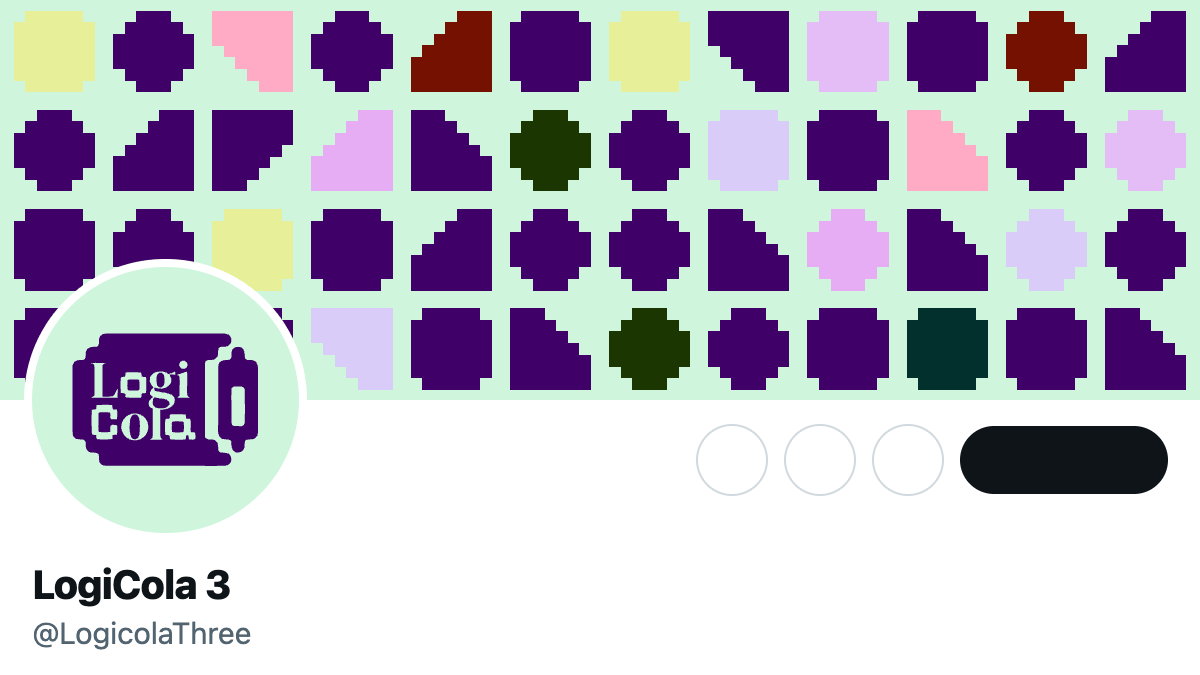
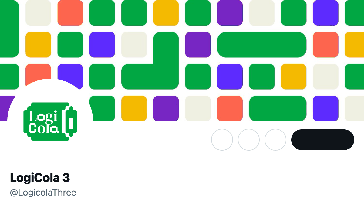
The colour scheme picked in 2024 (gold, violet, green, red) was inspired by hues often associated with the Catholic Church. Logic has been a foundational part of the core curriculum for Catholic education for centuries and many students using the product were Catholic. Gensler himself was a Jesuit priest. It was a fun nod, but to make the brand more consistent, I retired it.
The social media covers inspired me to do a deeper exploration of pattern design, to expand the expressiveness of the brand and tie everything together. Every exercise now opens on a pattern. Easy and hard drills have different patterns so you can tell them apart.
The process behind picking the patterns took days and multiple iterations. Here are the generators that survived. Three of them are currently being used:
Camo · classicThresholded value noise: the paint-program camo tile. Dresses the easy sets.
Designing a retro user interface
HackerNoon has an open-source pixel icon library that captures the essence of the early personal computer era. LogiCola was a perfect home for them. Their SVG files also helped me make sure the app is light and performant in places where the internet connection is slow or limited.
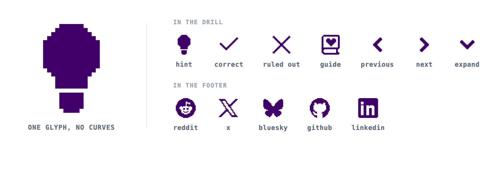
I looked to Google’s Material shape library to explore how shapes could be used to add flair to the interface in a thoughtful way. Following the decision of using pixelised artefacts, I redrew Google’s shapes. The result is below.
- Circle
- Square
- Slanted
- Arch
- Fan
- Arrow
- Semicircle
- Oval
- Pill
- Triangle
- Diamondpicked
- Clamshell
- Pentagon
- Gem
- Sunny
- Very sunny
- 4-sided cookie
- 6-sided cookie
- 7-sided cookie
- 9-sided cookie
- 12-sided cookie
- Ghost-ish
- 4-leaf clover
- 8-leaf clover
- Burst
- Soft burst
- Boom
- Soft boom
- Flower
- Puffy
- Puffy diamond
- Pixel circle
- Pixel triangle
- Bun
- Heart
Through this approach, I arrived at components like the buttons and the badge, used throughout the platform to signal new content. I went through multiple shapes and sat with them for a while. In the end, I picked the diamond turned on its side and stretched to hold the word.
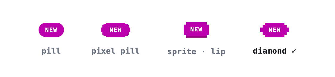
Here is the primary button under different shapes.
Install it or use it offline
Following my promise to make LogiCola accessible anywhere, I paid more attention to the mobile and desktop versions this time around. You can now install LogiCola on your device and practise logic drills even when you don’t have an internet connection, as long as you have opened it before. You can use the browser like you would before.
Most of the efforts to make LogiCola 3 work on mobile were made before. But the offline mode had never been properly implemented. I used this opportunity to refine the app and to introduce an icon that is still able to stand out among other apps without having to scream.
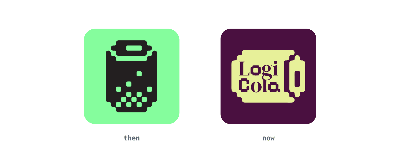
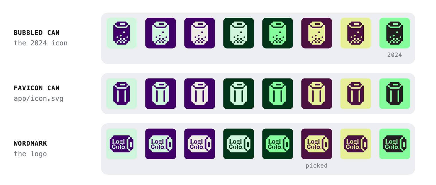
Vitor designed three icons in 2024: a soda can with bubbles, a simpler soda can that now sits on the browser tab, and a logotype. Below are some of the variations I played with before settling on the one in use today.
Better feedback
Another source of confusion came from how the options in a quiz were marked after you submitted an answer. I gave the same red outline to every option that was wrong. This meant it was impossible to tell which one was actually submitted by you. Seeing so many options turn red was also discouraging.
As a user on Hacker News pointed out:
I’m taking one of the tests and the feedback seems strange: although it appears I got it right, because the selected answer turns green, many of the other answers turn red (which usually indicates a failure) and other unselected answers also turn green. It’s confusing.
Here is the screen that comment was written about and the same screen now.
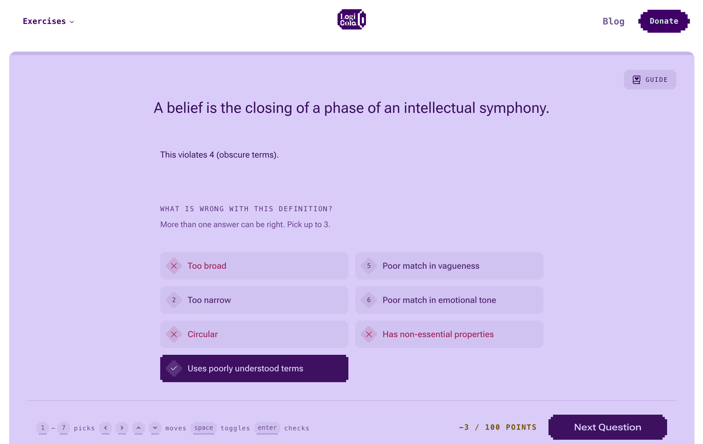
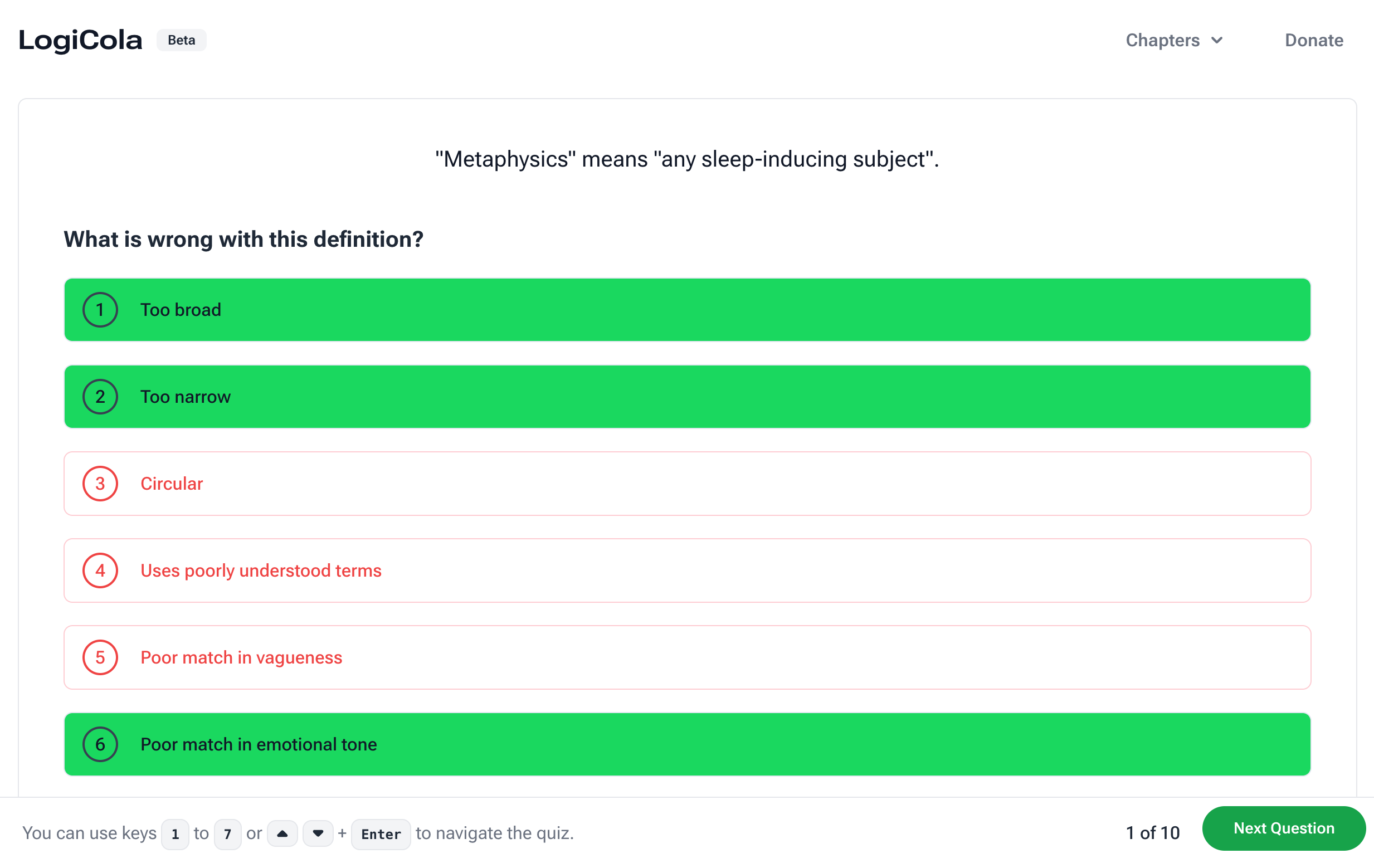
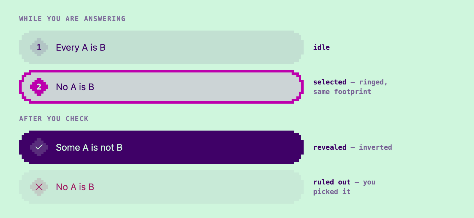
When you pick a wrong option, the visual cue now goes beyond colour and includes marking that option with a different shape (an X). And you can try again, instead of getting the answer revealed right away.
Here’s what the states for an option look like now:
One of the limitations of the earlier versions of LogiCola was the lack of support for picking multiple options. Definitions (Set Q) can be wrong in more than one way, but you could only pick one. You can select more than one correct answer now, and the exercise tells you when a question allows it.
Few quiz questions require more than one selected answer, it [is] impossible to select more than one (…) — issue #47.
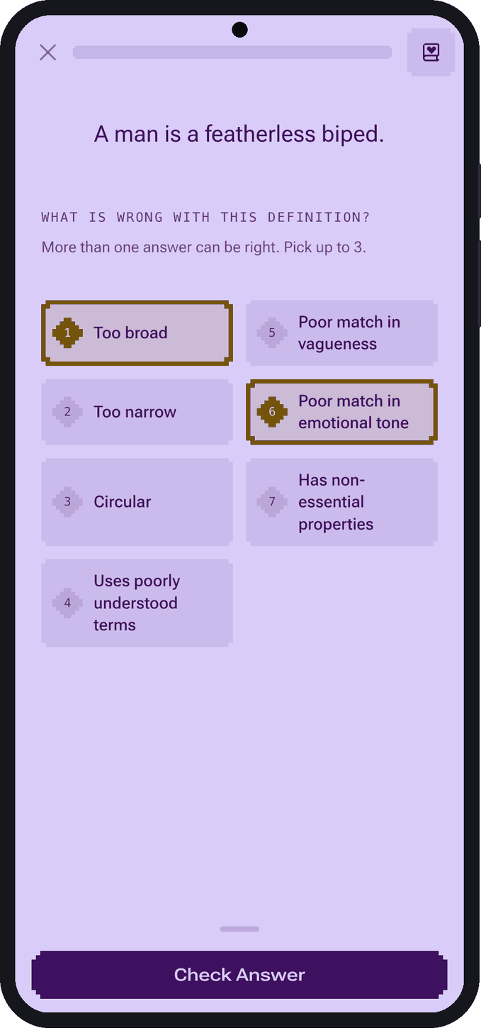
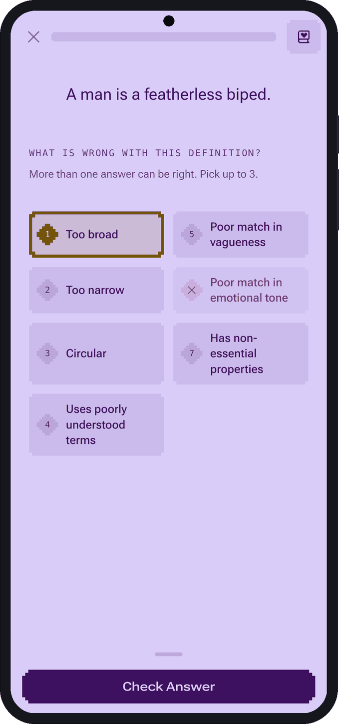
Above you can see what picking and checking an answer looks like now on mobile. Set Q, the same set that issue was filed against, is live. Give it a try.
A guide for every set
For anyone who learned logic from a different book, nothing on the page said what counted as a well-formed formula (wff, a formula that follows the syntax rules of that logical system).
The parentheses drew several comments:
You may want to check how you normalize or distinguish the logical representations. (…) These pairs are the same, the extra parentheses don’t change the meaning of the statements but only the ones with the extra parentheses are marked as correct.
The pair in question was (R ^ L) v N, marked incorrect, against ((R ^ L) v N), marked correct. In Gensler’s system every binary connective takes its own parentheses. So the two expressions are not the same formula in this system: one is well-formed and one is not. A student who never learns about the precedence of logical operators can join any two wffs by wrapping them and never be wrong.
Most sets now have a reference guide that you can check whenever you want to understand the notation or a concept that is a key to the completion of an exercise.
Guides open beside the questions and they are resizable, so you can keep your focus on the exercise and understand the shape of a valid answer without interrupting your flow.
Better accessibility
Despite setting out to make LogiCola more accessible, my considerations did not go beyond geography, operating systems and internet connection.
Many people could not reach the drills at all, because the menu ignored their screen reader:
I’m using [Firefox] on Windows with a screen reader and when I press the chapters button on the web page, absolutely nothing happens, so it is not clear how I’m supposed to test the website.
The navigation also vanished when the pointer strayed:
The button appears to be hover only, which is bad. On top of that, it expands content down to show the chapters, but if you move over and then down (instead of down then over), you exit the hover area and it closes. There are no visual indications of the boundaries of the hover area.
The navigation is a real menu now: a button that opens a list of links, works from the keyboard, and tells a screen reader what it is.
The same standard now applies inside the drills. Every set’s colours were checked for contrast before they were allowed in. A wrong pick is marked by shape as well as colour. There are still many accessibility challenges I haven’t addressed yet, but I’m aware of them now thanks to your feedback.
Infinitely generated questions
One of the commenters on Hacker News noted the platform was too focused on language and philosophical logic, failing to address mathematical logic. Back then, only propositional translations and informal logic (meanings and definitions) exercises were online. Since then, I added syllogistic, modal, deontic and belief translations into the mix.
Everything built up to 2025 was done by hand and required studying the original software and Gensler’s textbook up close. Routledge sent me a physical copy of the textbook. And by reverse engineering the 2008 program with Ghidra and AI tools, I gained a deeper understanding of the original and wrote generators that will give you endless practice in translations and explain every mistake you make right away.
The translation drills now run on templates. Most come from what I learned from the decoded source code from 2008. There are also new templates authored by me based on gaps of the original program. Here is one of Set C’s 34 templates as the program stores it:
*21 R:Gk.Only if you’re $B are you $D.Only if $j, $q
                # template 21, an untraced R:Gk., then the two prompts
c:a($q ⊃ $j)    # the options begin; a is the answer
b($j ≡ $q)
d$j ⊃ $q        # d, the bare formula
c($d)           # c is d, wrapped
R(~$j ⊃ ~$q)    # the contrapositive of a; untraced
j:y             # a jump: the record ends
$B and $D are adjectives, drawn fresh each time; their first letters become $j and $q. I decoded records like this one and rebuilt each as a generator that draws new names every time; the rule, the options and the hints stay his. Press Draw another.
Fixed-length quizzes are gone. They have been replaced by a point system that works like the original. Your score climbs as you answer, takes a hit when you miss, and you finish only when you reach 100 points.
This shape has a name in the learning literature: mastery learning, the idea Bloom proposed in 1968. The meta-analysis that followed (Kulik, Kulik and Bangert-Drowns, 1990) found mastery-based courses raise exam performance by about half a standard deviation, with the largest gains going to the weakest students.
The interface has a progress bar now, so you know how far along you are. To inject personality and make the platform feel more alive, I introduced micro-transitions and animations that were inspired by video games like Mega Man and Street Fighter.
Here are six of the directions I prototyped with AI tools. Press Miss to try them.
To make decisions about what made it into the product, I ran in-person tests where I tried to gauge people’s reactions. Through some iterations, option A (flash after taking damage) won. You can see it on the desktop and mobile versions of the app.
What started out as a preservation effort without a map became a modernisation, built from the original’s own formula. LogiCola 3 has gained new design elements, but it also gained new templates and a lexicon revision that makes the language used in the drills more relatable to students in 2026. I ventured into territory that is deeply outside of my comfort zone because of AI tools we have at our disposal and because of your support.
Thank you
This release exists because people took the time to write and share their feedback with me: gmdrd, Jtsummers, dexwiz, gostsamo, auggierose and gorjusborg on Hacker News; boxed, mnba, tessprime and rabuf on GitHub.
Vitor Abreu and Olena Diakonova set the brand foundation this work builds on. Ruxandra Duru expanded my understanding of colour theory, and Emil Kowalski taught me how to craft animations. Florian Grote and Sebastian Rosengrün, my professors at CODE University, gave me feedback and encouragement while I was a student there, and Ben Bachem read an early draft. Without the textbook Andrew Beck sent from Routledge, a generous donation from Professor Timothy Kearns, and the Ghidra MCP server that LaurieWired started and Benjamin Ethington expanded, this platform would not exist.
The pixel icons are HackerNoon’s. LogiCola is built with Khan Academy’s KaTeX for the formulas, and this blog with Sebastian Sdorra’s Content Collections.